Firefox add-ons improve readability by stripping distractions, adding dark mode, changing fonts, and zooming text for calmer, accessible web reading.
The modern web can be a hostile place for tired eyes. Tiny type, glaring white backgrounds, cluttered sidebars, and aggressive banners all compete with the actual words on a page. In 2026, screen time has not become less central to work, study, or leisure, so readability is not a luxury; it is basic access. Firefox add-ons offer a practical remedy. They do not rewrite the web, but they can reshape how it arrives on screen. Why should any reader have to fight a page just to finish a paragraph? A small set of browser tools can answer that question quietly and effectively.

A Compact Toolkit for Calmer Reading
The tools below approach readability from different angles. Some strip away distractions, some alter color and contrast, some change typefaces, and others simply make text larger. The right choice depends on the problem. A reader with eye strain may need a darker page, while a reader with dyslexia may need a different font. Someone who studies long articles may want a clean reader view, and someone who jumps between sites may want per-site zoom control. The following table offers a quick comparison before the detailed descriptions.
| Add-on | Best for | Standout feature |
|---|---|---|
| Tranquility Reader | Distraction-free articles | Removes ads and banners while adjusting layout |
| Dark Reader | Bright pages and night reading | Automatic dark mode with fine sliders |
| Mobile Dyslexic | Dyslexia-friendly reading | Replaces page fonts with a more accessible typeface |
| Readability based Reader View | Long-form reading | Reader view with full-screen and text-to-speech options |
| Invert Colors | Sudden bright screens | Quick color inversion with image preservation |
| Reader | Fast, simple cleanup | One-click conversion into a readable format |
| Zoom for Firefox | Small text and poor eyesight | Per-site zoom values and precise adjustment |
1. Tranquility Reader 🧘
Tranquility Reader is a strong starting point for readers who want a calmer page without a complicated setup. Once the add-on is active, a toolbar button turns the current webpage into a longer, thinner layout that is easier to scan. More importantly, it removes unnecessary content such as advertisements and banner headers. The result is not a different website; it is the same article with the noise pushed aside.
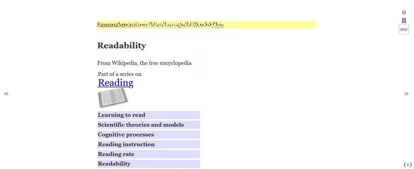
Customization is where Tranquility Reader becomes especially useful. A plus icon in the lower-right corner opens settings for background color, font color, font size, font selection, and other preferences. Readers who prefer warm tones can reduce the glare of a white page. Readers who need larger text can increase it without changing browser-wide settings. For a tool that is simple at first glance, it offers a surprising amount of control.
2. Dark Reader 🌙
Dark Reader addresses a common source of discomfort: bright pages that offer no dark mode of their own. Even when a site does provide a dark theme, the result may vary wildly from one page to another. Dark Reader automatically converts most webpages into a darker format, whether or not the site supports that option. The effect can be a relief during late-night reading or in a dim room.
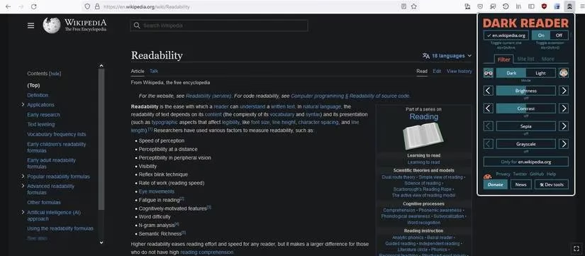
What makes Dark Reader more than a simple switch is its level of adjustment. Sliders control brightness, contrast, sepia, and grayscale. Settings can be saved for individual sites, which matters because a news site, a documentation page, and a forum may not need the same treatment. Preset themes, text adjustments, and inclusion or exclusion rules add further flexibility. Users can also toggle the effect off when a page looks better in its original form. Is that not exactly what a readable web should offer: control without commitment?
3. Mobile Dyslexic 🔤
Mobile Dyslexic is aimed at readers who find certain fonts difficult to process. After installation, it automatically replaces fonts across the web with a more dyslexia-friendly typeface. The change is immediate and broad, which makes it useful for studying, note-taking, and general browsing. It can also help readers with poor eyesight or persistent eye strain, even if dyslexia is not the primary concern.
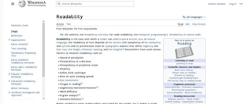
The add-on can be toggled on and off from the toolbar, so it does not have to become a permanent change. That flexibility is valuable for readers who only need extra help on certain pages or during longer sessions. Why should typography be a barrier when a browser can adapt it in seconds?
4. Readability based Reader View 📖
Readability based Reader View gives articles and webpages a dedicated reading mode. Installation opens a short introductory page that explains how to use the tool, which is helpful for readers who are new to Firefox add-ons. The default view reduces glare and presents content in a longer, more condensed layout. The page feels less like a busy interface and more like a document meant to be read.
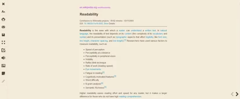
Additional settings include full-screen reading and text-to-speech. Those features matter for long articles, accessibility needs, and situations where reading on screen is not practical. The add-on does not try to be a full productivity suite; it focuses on presenting text cleanly and offering enough options to make that presentation comfortable.
5. Invert Colors 🔄
Invert Colors is a fast remedy for bright screens and the headaches that can follow long browsing sessions. As the name suggests, it inverts the colors of a webpage. The effect can be triggered from the toolbar or with a keyboard shortcut, making it a quick response rather than a deep configuration project.
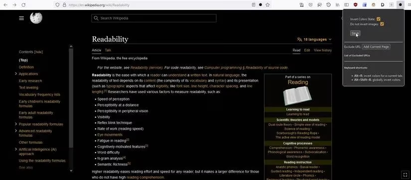
A particularly useful option allows images to be omitted from the inversion. That means the page background and text can become darker while photos and illustrations retain their original appearance. The result is not always beautiful, but it is practical. When a page is painfully bright, does a reader really need a perfect design, or just immediate relief?
6. Reader ⚡
Reader is the minimalist option in this collection. A single click in the toolbar converts a webpage into a more readable format. The add-on does not offer extensive customization, and it does not pretend to. Its appeal is speed and predictability. Readers who want a tool that works out of the box will find that Reader does exactly what its name suggests.
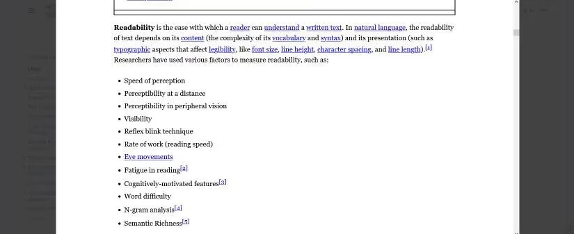
Sometimes the best accessibility tool is the one that removes friction before the reader has time to think about it. Reader fits that role well. It is not the most powerful option, but it is one of the easiest to understand.
7. Zoom for Firefox 🔍
Zoom for Firefox enhances the browser's existing zoom function by allowing different zoom values for different websites. A reader can keep one site at 110 percent, another at 150 percent, and a third at its default setting. A slider or a specific value can be used for finer adjustment. For readers with poor eyesight or difficulty with small text, this per-site control is a meaningful improvement.
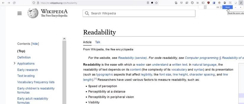
Browser-wide zoom is useful, but it forces every page into the same compromise. Per-site zoom recognizes that the web is not uniform. A documentation page, a social feed, and a news article may all need different scales. That small distinction can make daily browsing far less tiring.
The Bigger Readability Picture
No single add-on solves every readability problem, and that is precisely why a small toolkit makes sense. Tranquility Reader and Reader clean up layouts. Dark Reader and Invert Colors address brightness and contrast. Mobile Dyslexic changes type. Readability based Reader View supports long-form reading. Zoom for Firefox handles scale. Together, they give readers more control over the most basic question in digital reading: can the words be seen comfortably?
In 2026, the web is still crowded, bright, and inconsistent. Firefox add-ons cannot fix every poorly designed page, but they can give readers a practical advantage. For anyone who spends hours in front of a screen, that advantage is worth exploring. After all, reading should be about the text, not the struggle around it.