Productivity tools Sandglaz and Strike offer minimalist task management, reducing friction for efficient workflow in 2026.
I have always been drawn to productivity tools that strip away the noise. Over the years I have tried complex systems with subtasks, dependencies, Gantt charts, and tags, but I keep returning to a simple truth: the less friction between my thought and the action, the more I actually get done. In 2026, with more distractions than ever screaming for our attention, I have rediscovered the quiet power of two web apps that first gained attention fifteen years ago: Sandglaz and Strike. They remain testaments to the idea that sometimes a checkbox and a clean screen are all you need.
Both tools share a philosophy of radical simplicity. Sandglaz brings a collaborative grid-based approach, while Strike feels like a digital sticky note that lives in your browser. Neither requires a convoluted onboarding. Neither forces you to categorize every task into a dozen fields. Instead, they let you think about the work itself, not the system that manages the work. When I started using them again earlier this year, I noticed an immediate drop in the mental overhead I used to spend just organizing my to-do list.
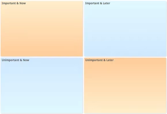
Let me walk you through Sandglaz first. When you open the app, you are greeted not by a long vertical list but by a grid divided into four cells. The default labels are Important/Later, Important/Now, Unimportant/Later, and Unimportant/Now. That simple Eisenhower Matrix instantly teaches you to prioritize without overthinking. I can rename those cells any way I want—sometimes I change them to specific projects like "Client Work," "Deep Focus," "Errands," and "Someday."
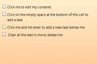
Adding a task is absurdly easy. I click the empty space at the end of any list inside a cell and type. To edit a task, I click on it. To delete it, I clear its text and it vanishes. Tasks can be dragged and dropped across cells, or even into completely different grids. I create multiple grids for different areas of my life—one for the weekly sprint at work, one for home maintenance, and one for the ambitious side project I keep promising myself I'll finish. Reordering grids is as simple as dragging them in the sidebar, which keeps the mental clutter at bay.
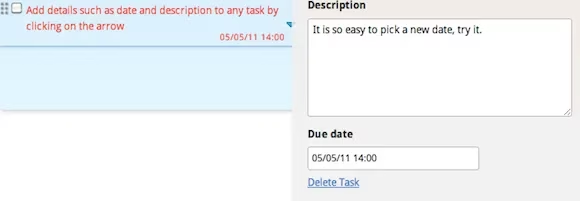
What surprised me most is the subtle power of due dates in such a bare-bones environment. When I hover over a task, a tiny arrow appears on the right. Clicking it reveals a date picker. I use this sparingly, only for tasks with real external deadlines. This restraint keeps the app feeling spacious. In most complex project managers, every task seems to demand a date, a reminder, and an alarm, which leads to notification numbness. Here, a date feels intentional.
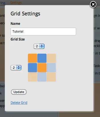
The settings for each grid are deliberately limited. I can choose between one and three rows and one and three columns. I rename or delete grids from the same panel. This might sound restrictive, but it is actually liberating. It means I cannot spend hours tinkering with a layout. The focus stays on the content.
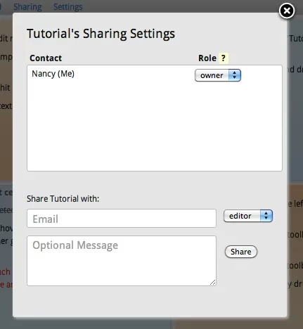
Collaboration in Sandglaz is woven in without muddying the interface. I click the sharing button, enter a team member's email, and assign them a role—Owner, Editor, or Reader. I have used this with my partner for shared grocery lists and with a freelance client who needed visibility into my task progress. The simplicity of the permissions model prevents the chaos that sometimes plagues shared workspaces.
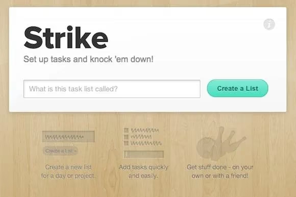
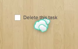
Strike, on the other hand, redefines what I consider a task manager. It is even more stripped down. There is no sign-up. I just visit the page, and a blank canvas with a single line awaits. I type, press Enter, and my first task appears. The visual delight comes when I finish something: with a quick drag to the right, the task flies off the screen, or if I prefer, it crosses itself out with a satisfying line. That micro-interaction gives me a tiny dopamine hit every time.
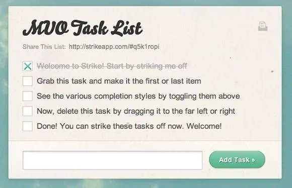
The user interface is nearly invisible. A barely-there menu at the top lets me tweak how completed tasks behave. I can choose to have them deleted instantly, struck through with a line, or moved to a graveyard at the bottom of the screen. I tend to switch between modes depending on my mood: on rough days I need to see the crossed-out victories piling up, while on focus-heavy days I prefer tasks to vanish completely so I can zero in on what remains.
Strike also lets me change the background image and color scheme. I have cycled through minimal gradients, nature scenes, and solid colors. This visual customization makes the tool feel personal without adding complexity. A task list resting on a calming landscape somehow makes mundane chores feel less oppressive.
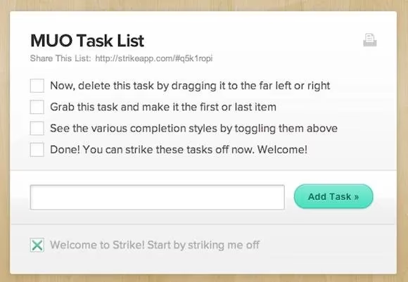
Sharing a Strike list is as simple as copying the URL and sending it to someone. There are no permissions to configure, no accounts to manage. This ephemeral, friction-free sharing has been perfect for planning weekend trips with friends or coordinating a quick errand run. The list exists as long as the browser tab does, and that transience oddly makes me more present with my tasks.
What I have learned from using Sandglaz and Strike side by side in 2026 is that simplicity is not a lack of features; it is an intentional reduction until only the essential remains. Sandglaz gives me structure without rigidity, while Strike gives me fluidity without chaos. Both remind me that checking off a task should be a small celebration, not a data-entry chore. If you feel overwhelmed by your current system, consider stepping back to something that asks almost nothing of you, except your attention and your next small action.
In a world where productivity apps compete to offer the most artificial intelligence, the most integrations, and the most metrics, these two tools stand quietly apart. They do not analyze my performance. They do not nudge me with reminders. They simply hold my intentions. And in 2026, that feels like exactly the right amount of help.